PressKit
story · 2 variants · pages: about, press, landingnpx shadcn-vue@latest add @trame/content-press-kit # Vue
npx shadcn@latest add @trame/content-press-kit # React-
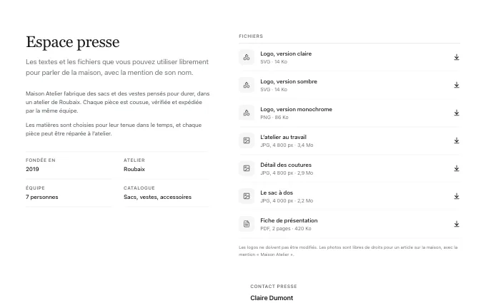 dossier
@trame/content-press-kit--dossierthe brand’s text on one side and its files as a list of rows with format and size on the other: the usual press page; the merchant’s own only
-
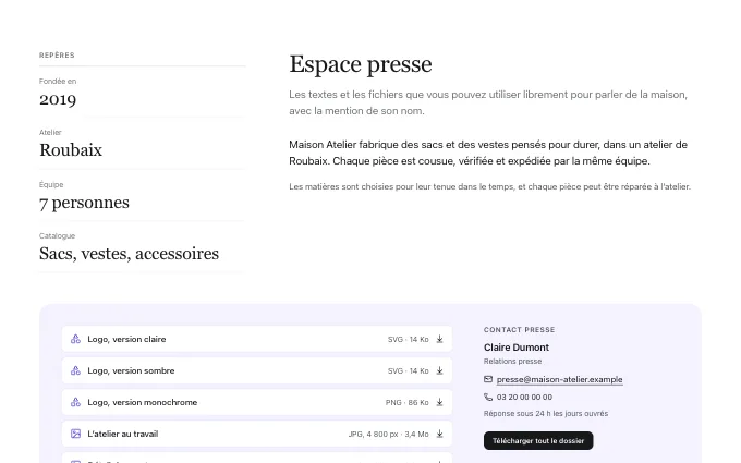 columns
@trame/content-press-kit--columnsa fact sheet: key facts in a column, the presentation beside them, the files and the contact below on a tint: a young brand with few files; the merchant’s own only