Team
story · 7 variants · pages: about, teamnpx shadcn-vue@latest add @trame/content-team # Vue
npx shadcn@latest add @trame/content-team # React-
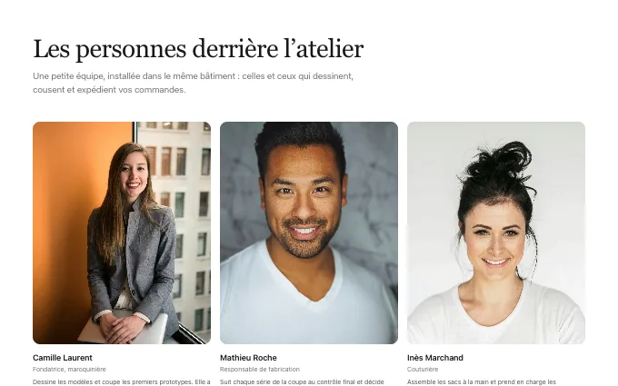 portrait-grid
@trame/content-team--portrait-gridportraits in a grid sized to the count, name and role under each: three to twelve people with pictures; the merchant’s own only
-
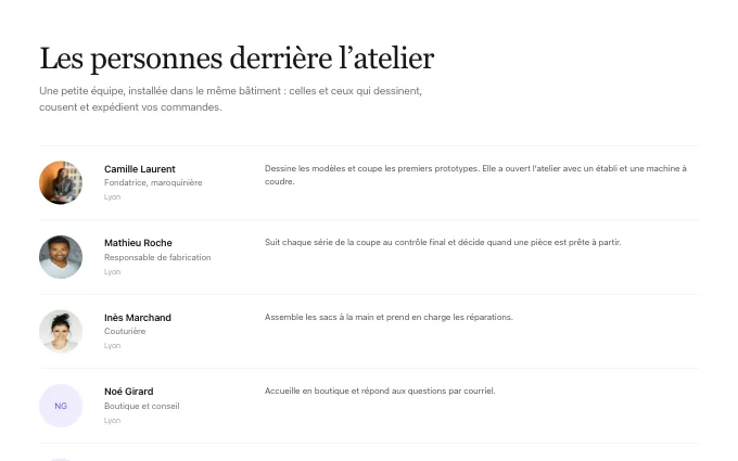 leadership-rows
@trame/content-team--leadership-rowsavatar, name, role and a few sentences per hairline row: three to six people to introduce properly; the merchant’s own only
-
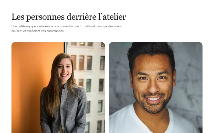 founders-cards
@trame/content-team--founders-cardsone to three large cards with a big portrait and a bio: the founders or owners; the merchant’s own only
-
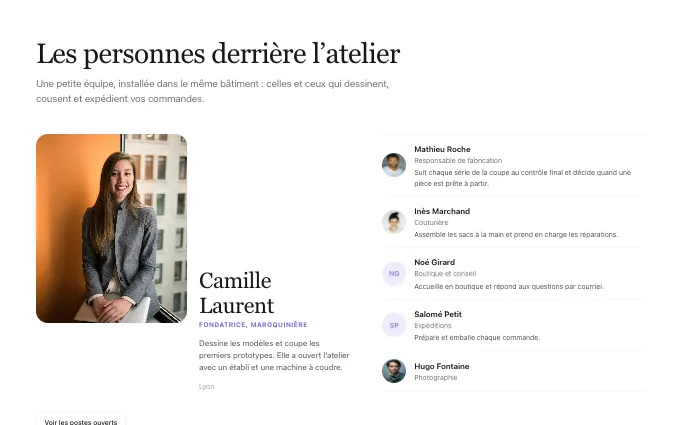 lead-and-crew
@trame/content-team--lead-and-crewthe first person large with their bio, everyone else as a compact list beside: a studio led by one person with a small crew; the merchant’s own only
-
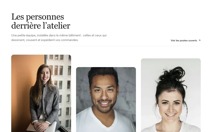 staggered-portraits
@trame/content-team--staggered-portraitstall portraits in one row at different heights and drops, the title and the link in a header line: three to six people with good portraits, for a studio or a small shop that wants its team to feel editorial; the merchant’s own only
-
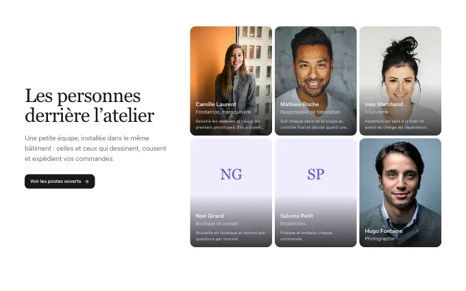 side-mosaic
@trame/content-team--side-mosaicthe title, the lead and the link in the left third, a tight mosaic of portraits on the right with name and role on each picture’s foot: four to six people on a team page where the words lead and the faces support; the merchant’s own only
-
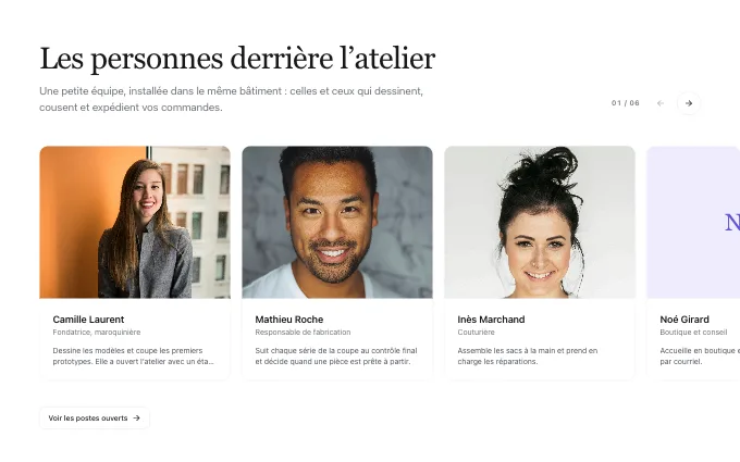 portrait-carousel
@trame/content-team--portrait-carouselportrait cards (picture, name, role, a short bio) in one row that steps by arrows, the next card peeking, a counter beside the title: six to twelve people in a section that must stay short; the merchant’s own only