WorkGrid
showcase · 8 variants · pages: home, landingnpx shadcn-vue@latest add @trame/content-work-grid # Vue
npx shadcn@latest add @trame/content-work-grid # React-
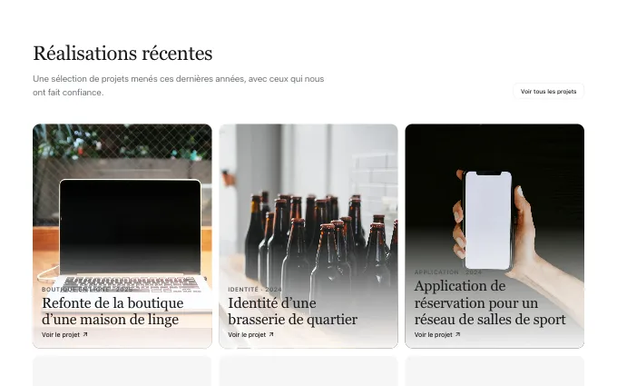 hover-reveal
@trame/content-work-grid--hover-revealpicture tiles with title and kind over a soft gradient, the link appearing on hover: a visual portfolio where pictures do the talking; the merchant’s own only
-
 lead-with-facts
@trame/content-work-grid--lead-with-factsone project told wide with its facts and results, the others as a short list under: a flagship case study; the merchant’s own only
-
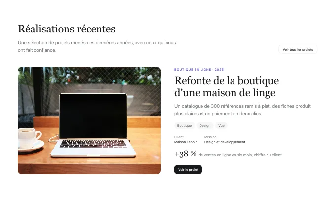 zigzag
@trame/content-work-grid--zigzagpicture and text alternating sides, with tags, facts and a button: three or four projects told one by one; the merchant’s own only
-
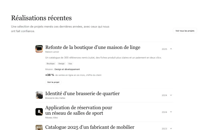 expandable-list
@trame/content-work-grid--expandable-listrows with name, client and year that open to detail, tags and result: a long, quiet track record; the merchant’s own only
-
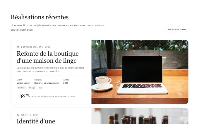 stacked-cards
@trame/content-work-grid--stacked-cardsfull-width project cards that pile up as the page scrolls, each with its facts and result: three to six flagship projects told one after the other; the merchant’s own only
-
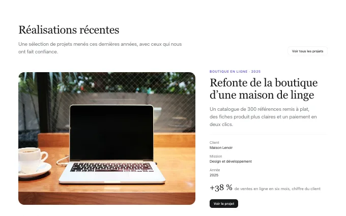 carousel-feature
@trame/content-work-grid--carousel-featureone project at a time with arrows, picture left and facts right: a few projects that each need space; the merchant’s own only
-
 heading-tile
@trame/content-work-grid--heading-tilean edge-to-edge two-column wall whose first cell is the heading, the pictures filling the rest in staggered columns, client and title on each picture: a portfolio of four to seven strong pictures; the merchant’s own only
-
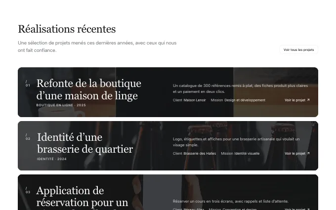 picture-bands
@trame/content-work-grid--picture-bandsone wide band per project with its picture as a darkened ground, number, title and kind at the left, a two-line summary and the facts at the right: three to six flagship projects listed as bars; the merchant’s own only