FeatureCarousel
features · 3 variants · pages: home, landing, product, appnpx shadcn-vue@latest add @trame/landing-feature-carousel # Vue
npx shadcn@latest add @trame/landing-feature-carousel # React-
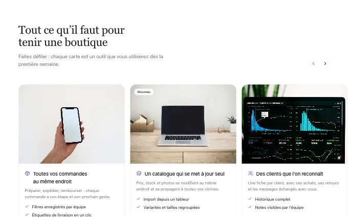 cards
@trame/landing-feature-carousel--cards3 to 8 features as large cards with a picture above their words, buttons above the rail: the main capabilities, each with a screen
-
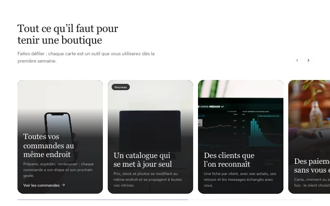 overlay
@trame/landing-feature-carousel--overlay3 to 8 tall pictures with their words over a calm foot, cards that lean toward the pointer: a visual, bold tour of the offer
-
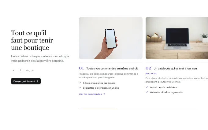 side-heading
@trame/landing-feature-carousel--side-heading4 to 8 features after a heading column that stays beside the rail, numbered and open: a long list to browse without a heavy page